
(HOUSING – BUILT – SYDNEY)
The Porter apartment is an exercise that combines restraint and exuberance.
Wyldefel Gardens is a low-rise group of apartments designed in 1936 by John Brogan.
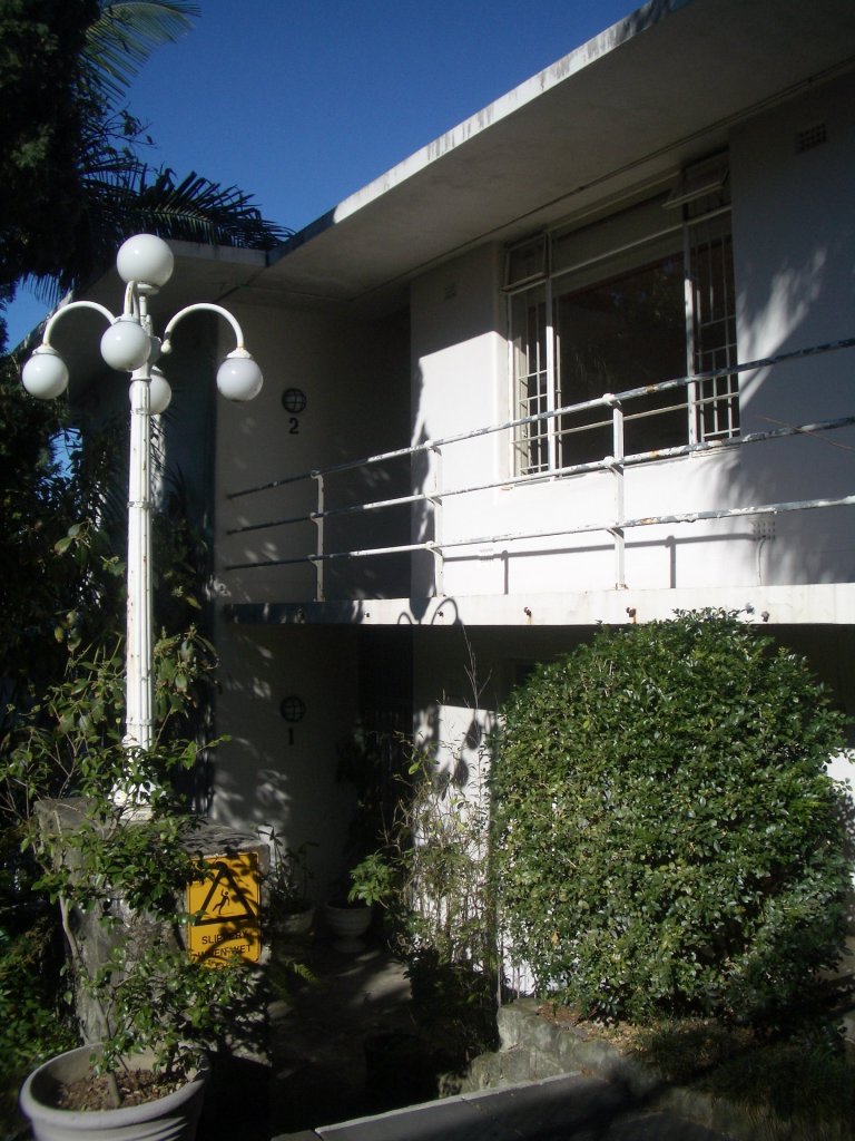
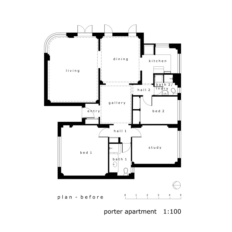
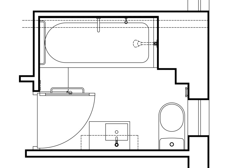
With its sensible planning, good proportions, restrained ‘moderne’ style and private garden outlook this existing apartment provided a good, strong base to work with. The brief was to improve the potential use of the open plan spaces and to renovate the bathrooms.
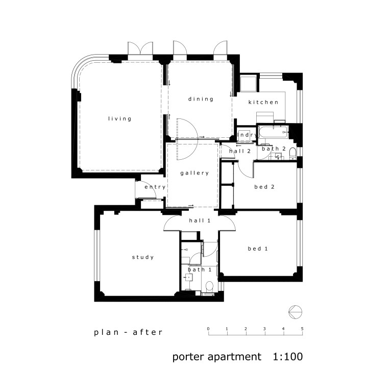
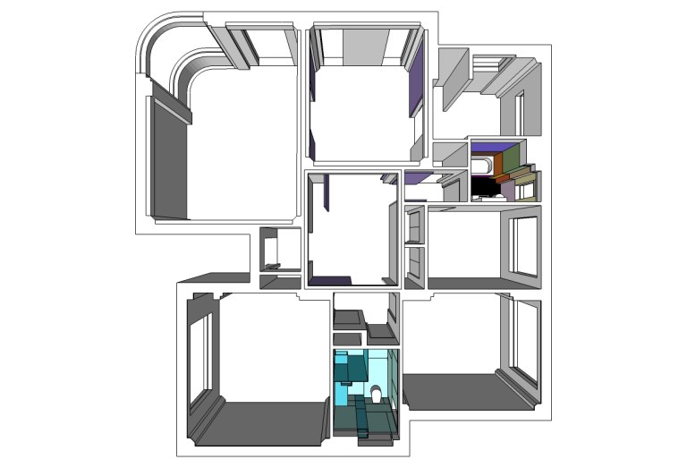
The owner liked the open plan, but found that it limited her use of the apartment. The solution was to introduce a series of new sliding and pivoting screens, particularly around the dining area, creating the possibility of greater privacy when required as well as a variety of arrangements allowing the spaces to vary in size, proportion and mood depending on the required or desired function. Designed to also carry artworks, the screens are painted the same colour as the walls, but can be repainted any time to any colour.
The new design is a complementary alteration to this stylish historic apartment.


Link to Marika Varady website


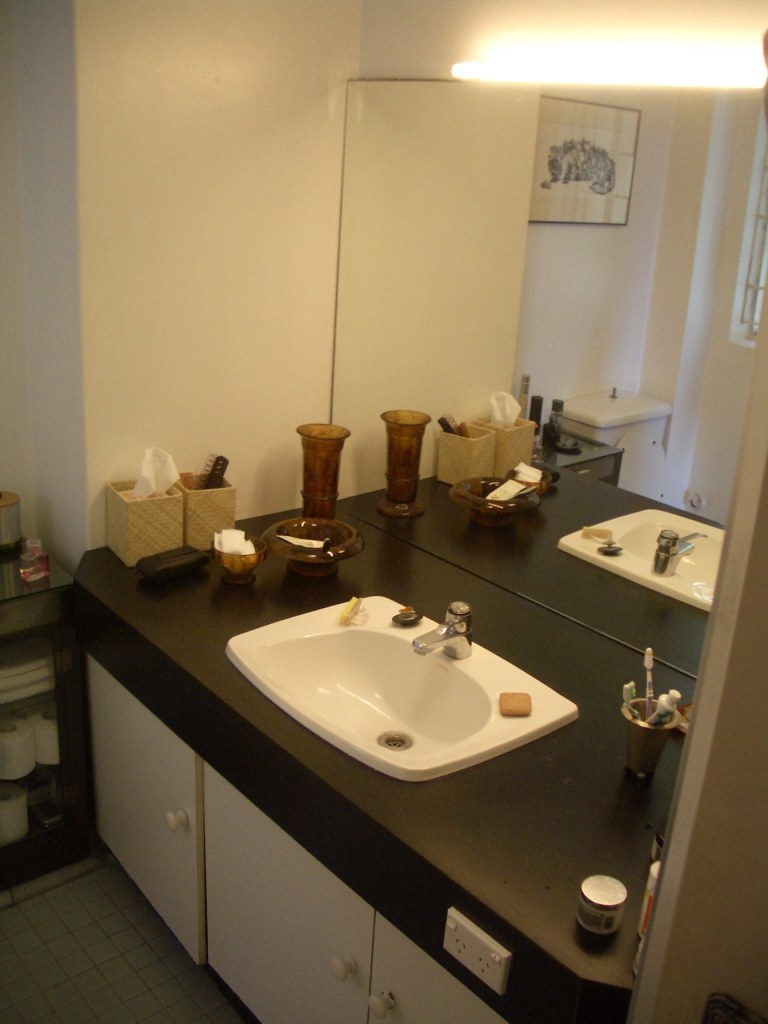
The bathrooms are sculptural studies in glass. The owners’ bathroom is white, while the guest bathroom is vibrant and playful with coloured glass walls.
The walls and floor of the main bathroom are clad in white Colourback glass – the natural colour of the glass giving the panels a slight green tinge. The joinery is made of translucent blue Marblo to complement the watery feel of the spa-like space.


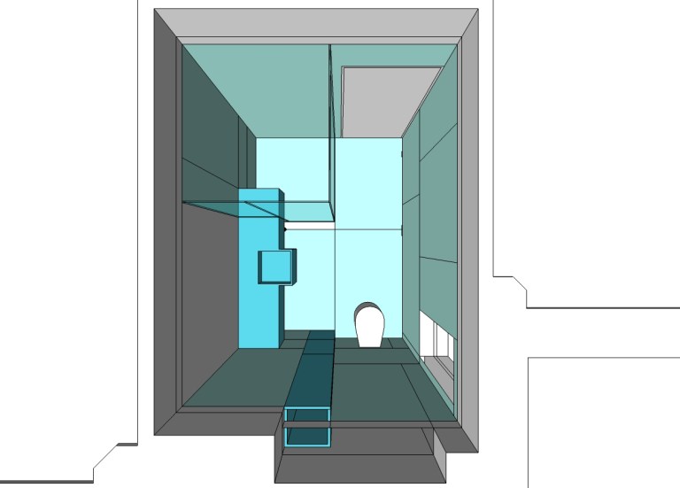

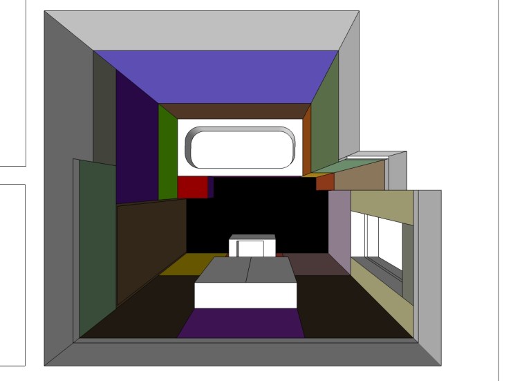
The design of the guest bathroom was inspired by the colours in the paintings of Mark Rothko, with the walls clad in an abstract composition of 29 glass panels, all back-painted with a different Dulux colour. Despite the use of so many colours, due to the size of the bathroom you never see all of them at the same time. Therefore the perception of the space shifts depending on which direction you are looking, creating a vibrant, yet surprisingly serene space.


COLOUR STUDIES
The colours for the guest bathroom were selected after studying the colour relationships in the paintings of Mark Rothko, one of the owner’s favourite painters.
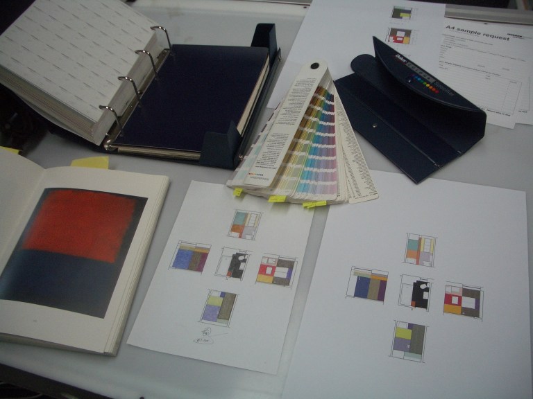
The drawings were initially coloured in pencil, then translated to computer drawings, then 3D renders.


Colour samples were obtained from Dulux paints and tested before proceeding.


IMAGES


Go to the MENU (above right) to sign up to receive regular posts.
And you may also like to view the links below:
ABOUT STEPHENVARADY_ARCHITECTURE
ALSO HAVE A LOOK AT STEPHENVARADY_ARCHITRAVELLER
ALSO HAVE A LOOK AT STEPHENVARADY_INTERIORTRAVELLER
ALSO HAVE A LOOK AT STEPHENVARADY_CREATIVITYBLOG
